Why Your Crypto Trading Bot Backtest Fails: Test Against 100 Charts, Not One
By Felix – founder of unCoded, trading crypto since 2016.
Every backtest you've ever run lies to you in the same specific way.
You picked a token. You picked a time range. You ran your strategy against that exact historical chart. The numbers looked good. You deployed. Within weeks, the live results didn't match the backtest.
This isn't always slippage, fees, or execution quality – though those matter. Most of the time, it's something more fundamental:
You didn't test a strategy. You tested whether your parameters happened to fit one specific chart.
Let me explain why this matters, and what actually solving it looks like.
The overfitting problem, stated plainly
When you backtest a strategy on BTC/USDT from January to December 2024, you're testing it against exactly one sequence of price movements. One specific path that Bitcoin happened to take. One particular combination of bull phases, corrections, consolidations, and breakouts.
If you adjust your parameters until the backtest looks good on that chart, you've created a strategy optimized for that chart. Not for Bitcoin in general. Not for crypto markets broadly. For the specific historical path those prices took during that specific window.
Change the window – test January to December 2023 instead – and the strategy often falls apart. Change the token – run the same parameters on ETH/USDT – and it falls apart again. Not because the strategy is bad. Because you never actually validated it against market behavior. You validated it against one frozen sample of market behavior that will never repeat exactly.
This is overfitting. It's the single biggest reason retail backtests look beautiful and live results look ugly.
Most traders know this word exists. Almost nobody solves it in practice.
The half-solutions that don't work
The standard advice is: "test on out-of-sample data." Take your strategy optimized on 2023 data and validate it on 2024 data.
This catches some overfitting. It doesn't catch enough.
The problem is that 2023 and 2024 are still specific chart sequences with specific properties. If your strategy happens to work on both, you've eliminated the worst kind of overfitting – but you haven't proven the strategy generalizes. You've just shown it fits two charts instead of one.
The other common approach is multi-year backtesting. "Test across 2020-2024 to cover different market regimes." Better than single-year testing, but still ultimately one long chart sequence. Bitcoin's 2020-2024 path is a single deterministic series. Your strategy either fits it or it doesn't. There's no way to tell from the result whether it would have worked in a parallel universe where Bitcoin had taken a slightly different path with similar statistical properties.
What you actually need is many different charts with similar underlying characteristics – so you can see whether your strategy works across the pattern space, not just against one specific historical sample.
Chart shuffling: the real solution
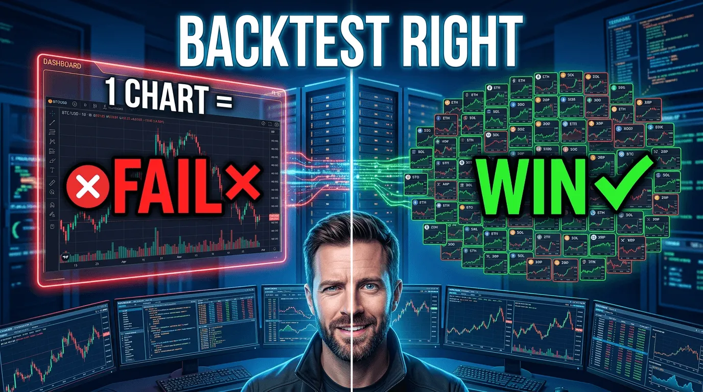
The approach we built into unCoded is conceptually simple but computationally intense. Instead of testing your strategy against one token's chart, we test it against every token available on Binance for your chosen timeframe.
That's not a typo. Every spot pair. Every historical chart for the period you specify. One hundred different tokens, sometimes more, each with their own price patterns, volatility profiles, and market behaviors.
Your strategy gets run against all of them simultaneously.
If your configuration makes money on BTC/USDT but loses money on ETH/USDT, LINK/USDT, SOL/USDT, and sixty other pairs, you didn't build a strategy – you overfit to Bitcoin's 2024 chart. If your configuration produces positive results across 70% of tested pairs, you probably built something that actually generalizes. If it's profitable on 90%+ of pairs with reasonable risk metrics, you've built something genuinely robust.
The output isn't a single equity curve. It's a distribution of equity curves – one per token, each showing how your strategy performed in that specific market. You see the winners, the losers, the edge cases, the tokens where your strategy produced exceptional results, and the tokens where it failed completely.
That distribution is what tells you whether your strategy actually works.
What this reveals that single-chart testing hides
The multi-chart approach surfaces information that single-chart backtesting systematically conceals.
It shows regime sensitivity. A strategy that works brilliantly on trending tokens but fails on ranging ones is immediately visible. You see which market conditions your strategy exploits and which it can't handle. This is impossible to see when you're only looking at one chart that mixes trending and ranging phases together.
It shows fragility. If your strategy produces 40% returns on 10 tokens and -30% returns on 90 tokens, the aggregate might look acceptable on average – but what you've actually built is a lottery ticket that needs exactly the right market to pay off. Live deployment will tell you the same thing much more expensively.
It shows which parameters actually matter. When you adjust a parameter and see the change propagate across 100 different tokens simultaneously, you can distinguish between parameters that genuinely improve the strategy and parameters that just happen to help on your test chart while hurting elsewhere.
It exposes survivorship bias. Many traders unconsciously backtest on tokens that happened to perform well historically. Multi-chart testing includes tokens that went to zero, tokens that had catastrophic drawdowns, tokens that spent years in deep bear markets. If your strategy can handle those, you have confidence it can handle real market variety. If it only works on tokens that already did well, you've built something that retrospectively fits a filtered sample.
It reveals edge-case failures. Every strategy has market conditions that break it. Multi-chart testing shows you exactly where and how. You might find your strategy works perfectly except on tokens with daily volume below a certain threshold, or tokens with specific volatility patterns, or tokens during extended accumulation phases. That information lets you either add exclusion rules or avoid deployment in those conditions.
None of this is visible from a single-chart backtest, no matter how carefully you run it.
The trap of optimizing after seeing the results
There's a subtle danger in chart shuffling that's worth addressing directly.
Once you run your strategy against 100 tokens, you're tempted to go back and adjust parameters based on which tokens failed. Tweak the RSI threshold to help the LINK result. Add a filter that would have saved you on the SOL drawdown. Keep iterating until the distribution of results looks uniformly good.
This is just overfitting at a higher level. You've shifted from fitting your strategy to one chart to fitting it to the ensemble of 100 charts. When you deploy, the same fundamental problem emerges – you tuned to a specific dataset rather than discovering something that generalizes.
The discipline required is hard. You run the test. You interpret the distribution. If the strategy fails widely, it fails – don't iterate it into false success. If it succeeds widely with some specific failure cases, understand why those cases failed and decide whether to exclude them from live deployment (legitimate) or re-tune parameters to capture them (dangerous).
The goal of chart shuffling isn't to produce a strategy that wins against all 100 tokens. It's to give you honest information about where your strategy works and where it doesn't, so you deploy it only in conditions you've genuinely validated.
Why nobody else does this
Chart shuffling is computationally expensive. Backtesting a strategy against one token for a year at 1-second resolution already requires processing tens of millions of data points. Running that against 100 tokens simultaneously multiplies the workload by two orders of magnitude.
Most retail bot platforms can't do this because their backtesting infrastructure wasn't built for it. They run against candle-close data (which misses intracandle events) on limited historical windows (which constrains the data available) for one token at a time (which keeps compute costs down). The combination produces backtests that are fast and cheap to run – and systematically misleading about real-world performance.
Commercial platforms that could afford to build this mostly don't, because their users don't know to ask for it. Users evaluate backtesting by whether it shows positive numbers, not by whether those numbers predict live performance. If single-chart testing produces prettier results (which it does, because overfitting looks great retrospectively), there's no commercial pressure to build something more honest.
This is one of the places where the profit-sharing model of unCoded shapes the product in ways subscription platforms can't match. We only make money when users actually succeed in live markets. If our backtesting produces numbers that mislead users into deploying strategies that fail, we lose – they cancel, they leave bad reviews, they spread the word. Honest backtesting is in our direct financial interest in a way it isn't for platforms that collect subscriptions regardless of outcome.
So we built the expensive version. The version that takes real compute resources to run. The version that surfaces uncomfortable truths about strategies that would look beautiful on a single-chart test. Because the alternative is building a tool that feels good to use and systematically harms the users who trust it.
What the workflow actually looks like
In practice, running a multi-chart backtest in unCoded works like this:
You configure your strategy – entry conditions, exit conditions, position management, risk controls. You pick a timeframe for historical data – typically six months to two years. You run the backtest.
The system processes your strategy against every available spot pair on Binance for that time window. Each pair produces its own complete result: trade log, equity curve, drawdown profile, Sharpe ratio, win rate, profit factor.
Then you see the distribution. How many tokens produced positive returns. How many produced negative. What the average return was across the ensemble. What the median was. What the worst-case drawdown looked like and on which tokens. What the best-case performance was and what made those tokens different.
From there, you can either deploy the strategy with confidence that it generalizes, or you can look at the failure modes and understand what market conditions break it. Both outcomes are useful. Only one of them was available to you from a single-chart backtest.
The deeper point
Backtesting exists to answer one question: if I deploy this strategy with real capital, what's likely to happen?
Single-chart backtesting answers a different question: how would this strategy have performed on this specific historical sample I chose to test it on?
Those questions sound similar. They're not. The first is about the strategy's actual edge. The second is about how well you fit parameters to a particular dataset. One gives you actionable information. The other gives you a false sense of confidence.
Chart shuffling gets closer to answering the real question. Not all the way – live markets have factors no backtest fully captures, including your own psychological responses to real drawdowns with real capital at stake. But it closes the gap between backtest confidence and live performance in a way single-chart testing fundamentally cannot.
If you're serious about deploying automated strategies with real capital, the question isn't whether your backtest looks good. It's whether you tested against enough variety to trust the result.
One chart doesn't give you that. A hundred charts get you meaningfully closer.
Recommended Reading

Crypto Trading Bots Won't Make You Rich – But They Can Pay Your Bills
By Felix – founder of unCoded, trading crypto since 2016. Every time I see an ad for a crypto tradin...

Why Crypto Trading Bot Subscriptions Are More Expensive Than They Look
By Felix – founder of unCoded, trading crypto since 2016. Most retail traders evaluate trading bot p...

The Swarm Intelligence: Why unCoded Is Built Different
By Felix – founder of unCoded, trading crypto since 2016. Most trading bots work on an implicit assu...
Why 99% of My Trading Bot Customers Make Me Zero Money (And Why That's the Point)
By Felix – founder of unCoded, trading crypto since 2016. Here's something most founders wouldn't wr...
Bitcoin Trading vs Holding: The Honest Math No One Wants to Show You
By Felix – founder of unCoded, trading crypto since 2016. Let me start with the conclusion because i...